Emerald Aisle
With a painterly swash of green, these vibrant invitations are bold yet sophisticated. Laurel branches and emerald tones throughout maintain cohesion, while white accents add flair. “The most important thing when I work with couples is to talk with them to really find what fits with their style,” says designer Katie Murphy of Katie Murphy Stationery. “I like to make sure we are working with who they are as a couple in every aspect.”
Blushing Bride
This rose- and beige-tinted suite, complete with gold foil lettering and elegant script, will leave any couple tickled pink. The watercolor effect, created in a neutral color palette, adds texture and a playful contrast with the formal lettering. For these invitations, designer Gina Peterson of Ginger P. Designs made a point of incorporating the couple’s color scheme. The bridesmaids wore various shades of rose quartz and blush, so the watercolor paired with the quartz details card was “the perfect touch.”
Something Blue
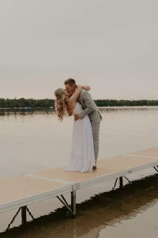
Using a sophisticated typeface against a graceful blue, this design from A Milestone Paper Co. will start your wedding journey with a dose of pure bliss. “The bride knew she wanted to reflect the lakeside setting, but in a soft, subtle way,” says designer Sarah Glad. “Watercolor washes and florals were the perfect way.” The eggshell cardstock sets off the delicate hues, so serene you can almost feel the lake breezes.
Golden Touch
“My favorite element of this design would be the watercolor wash and the digital watercolor paper effect or the foil stamping,” says Brian Durk of Dick and Jane Letterpress Co. These invites, which were lovingly created for wedding of the designer’s brother-in-law, are a classic example of marrying different techniques. The modern, minimal aesthetic is juxtaposed with whimsical fonts and gentle shades of green, for a design that’s a delight to receive in the mail.
