Stone-Cold Love
The chic couple behind this invitation told Catherine Polacek of Printerette Press that they loved the look of Carrara marble, along with clean, modern fonts and luxe details. “We wanted the suite to feel beautiful yet masculine, minimal but not boring,” says Polacek. First she created loose hand-lettering for this suite, using lowercase letters for a contemporary vibe. The marble pattern was flat-printed on 100 percent cotton paper, then duplexed to another sheet to create an especially thick ground for the copper foil stamp. The invitations were wrapped with a vellum sheet, sealed with a custom wax seal and slipped into envelopes lined with a matching copper hue. Printerette Press, Minneapolis, 612.568.6841, printerettepress.com
Botanical Garden
Calligraphy was a must for this design, which references vintage botanical illustrations with all their lush hand-drawn detail. To give the antique look a modern twist, Shasta Bell began with several pencil sketches of the lettering and design. “Then I take out my black sumi ink, dip my straight pen and Nikko G nib into it, and begin.” The pale pink ink on thick ivory paper is a subtle contrast to the exotic floral image on the vellum wrap; a thick gold wax seal adds vintage opulence. Shasta Bell Calligraphy, Minneapolis, shastabell.com
Old World Romance
“We wanted to capture the rustic elegance of Provence and Tuscany and transplant it into the gorgeous Californian vineyard where this couple was wed,” says Shasta Bell. To create this suite, she made original watercolor illustrations of an olive wreath motif, along with a hand-drawn map featuring local landmarks with homespun, understated charm. This suite, she admits, is one of her favorites—“I absolutely love creating heirloom pieces my clients will treasure for years to come.” Shasta Bell Calligraphy, Minneapolis, shastabell.com
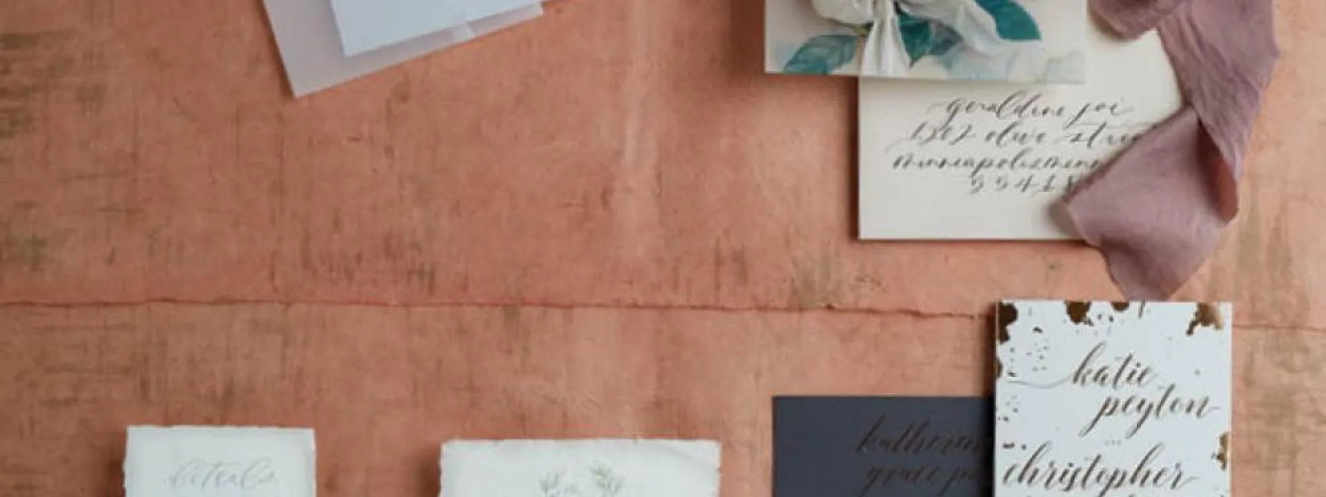
Yin and Yang
This invitation suite by Gretchen Berry of Gretchen Berry Design Co. combines light and dark elements with a variety of textures, colors, fonts and finishes. The couple was delighted with the final product, which Berry describes as “a graphic modern look mixed with a bohemian feel” combining both masculine and feminine vibes. To achieve this dramatic look, a custom cotton pocket with rose-gold and champagne foil was laser-cut in a geometric pattern for a glimpse of the dark, double-thick invitation inside. The reply card and information card were printed on hand-torn blush cotton stock, pulled together with a romantically flowing gold-foil script. Gretchen Berry Designs, Minneapolis, 952.922.5176, gretchenberry.com


